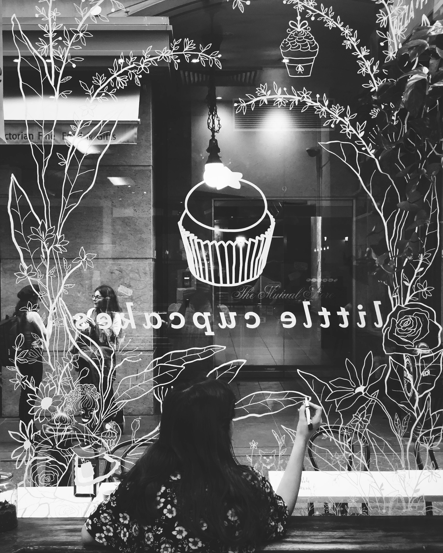
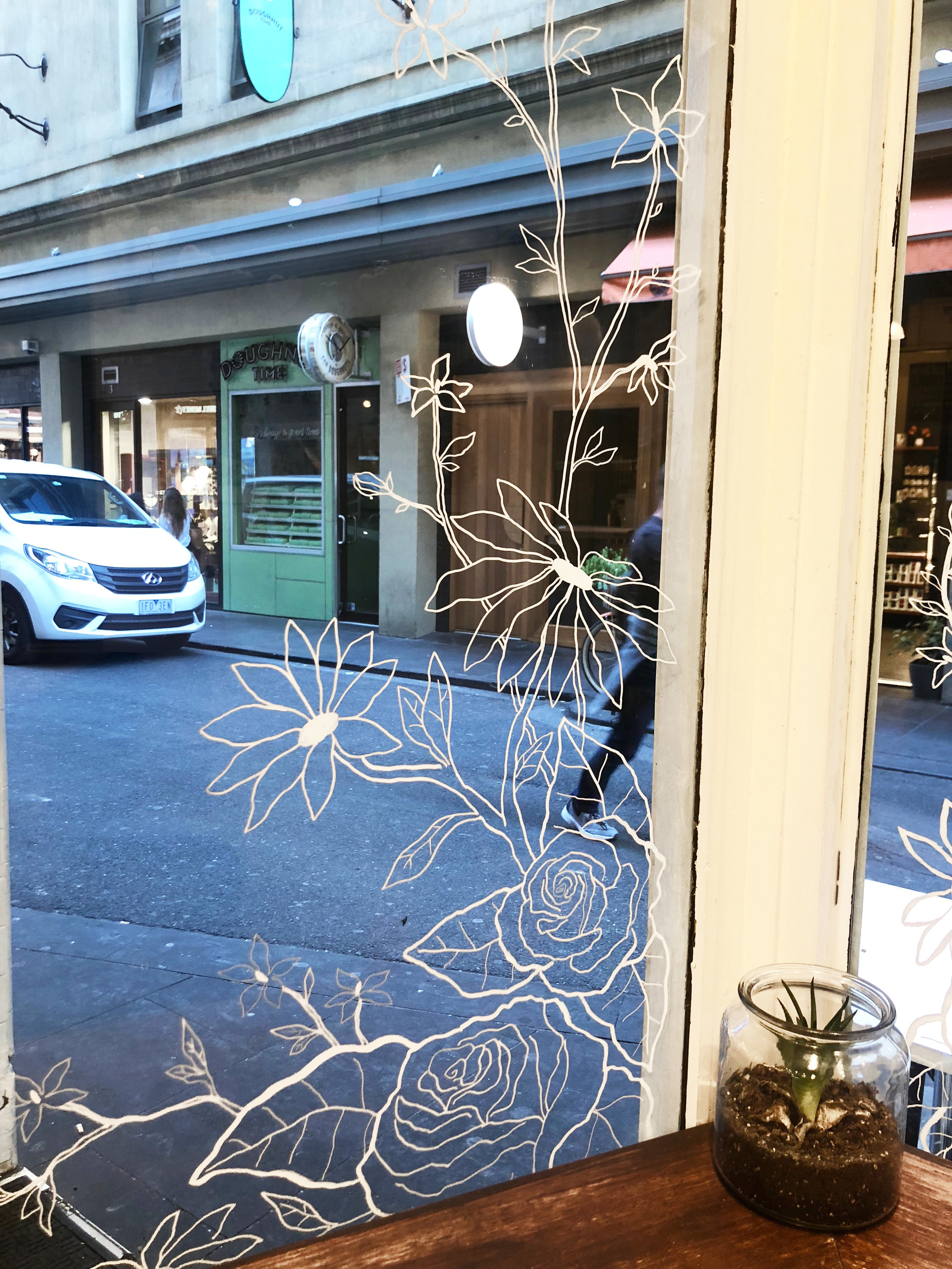
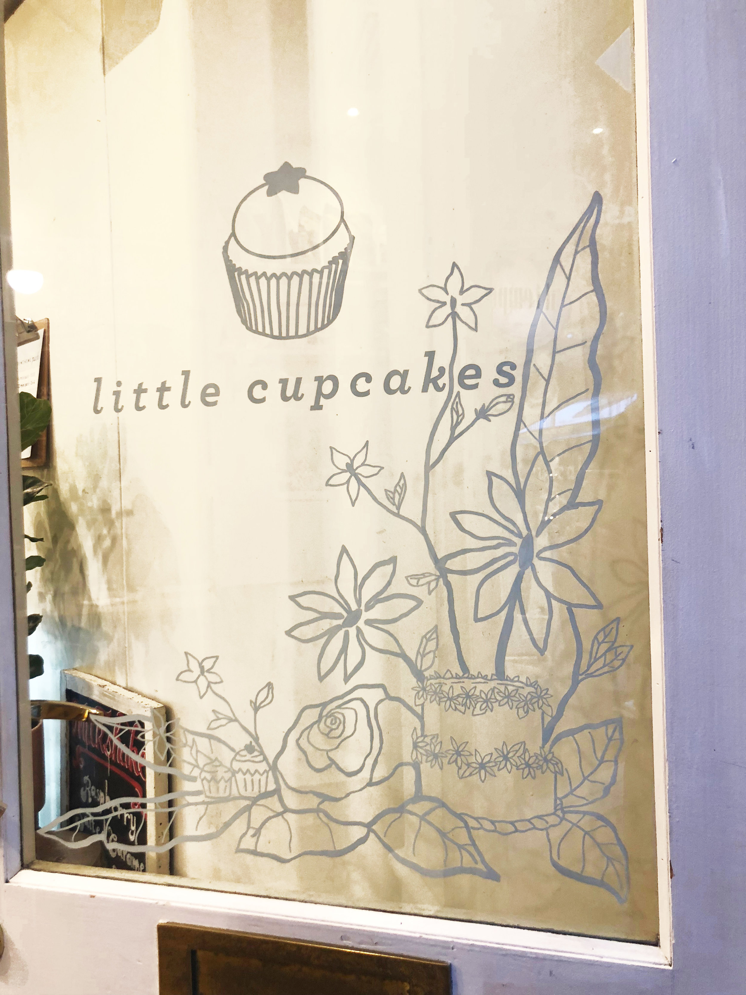
I recently had the opportunity to illustrate Little Cupcakes three windows for their Degraves St shop! The whole process from researching, designing to creating the final piece was a lot of fun and a great learning opportunity. In this post I will go through my process of creating a window illustration!
I was approached by Amy of The Social Sister Project who was in search of someone who could create a new shop display for her client Little Cupcakes. I beamed at the idea as I had known for a while that window illustrations was something I was looking to add to my services and this seemed like the perfect opportunity to start!
The store Little Cupcakes was getting a new face lift and part of this was the window illustration. The theme for the window was ‘the secret garden’. Lots of flower and plant illustrations, a girl holding a cupcake or sitting in the flowers. This design was to compliment the new styling of the shop with hanging plants and a new paint job.
To gain an idea of how I could illustrate a window and what medium/style I would use I researched existing window displays and made a Pintrest board featuring windows that caught my attention: https://www.pinterest.com.au/jessicajaneillustration/window-shop-illustration/
I found the use of white chalk markers to make window drawings to be very trendy at the moment and something that complimented my work well. As I tend to draw in black on my own illustrations, drawing in white on a window would be a suitable transition.
The chalk markers I chose to work with was Uni Liquid Chalk Marker in White. These came in three sizes which I liked so I could keep variety in the thickness and thinness of lines. The markers utilise water-based pigment ink so you can mark on windows, glass, mirrors, plastic and metal surfaces with ease. The ink doesn’t wash off in the rain, yet is easy to remove with a damp cloth.
Once I had confirmed with my client the style and medium on offer I began to design the windows. Things I needed to consider was the size of each window and placement of branding so my design could fit within this template and not go over the logo. I also brainstormed other ways I could add additional cupcakes to the design as that is what the store is all about! I added hanging cupcakes, and a cupcake themed picnic whilst researching the cupcakes made in shop. I incorporated flowers such as roses and daisies as well as Australian plants like eucalyptus leaves and corymbia.
Because the design was so large and detailed I printed out a reverse real size template of the design to stick to the outside window while I traced over the design from the inside. When it came to drawing up high I used a stable ladder so I could cover the whole window.
It took a whole day to physically draw on the three windows, starting at 8am and finishing at about 5pm. Actually covering the outside windows with the paper template took a good hour to make sure each sheet was inline and matching!
This was a very enjoyable experience to spend a few days working on a window illustration and the final result was worth every minute!
Since completing this display I have now added window illustrations to my services and am accepting personal or business commissions!
To find out more view my window display page here


